Historic Trends
Use the Historic Trends dashboard to view inventory history for all dairies from the past year. Use one of the many provided metricsone of the many provided metrics to break down the inventory history further to learn more about your dairies. For example, you can check metrics for specific health events, such as Total Mastitis Incidences, to see whether cases of mastitis have increased or declined in the past year.
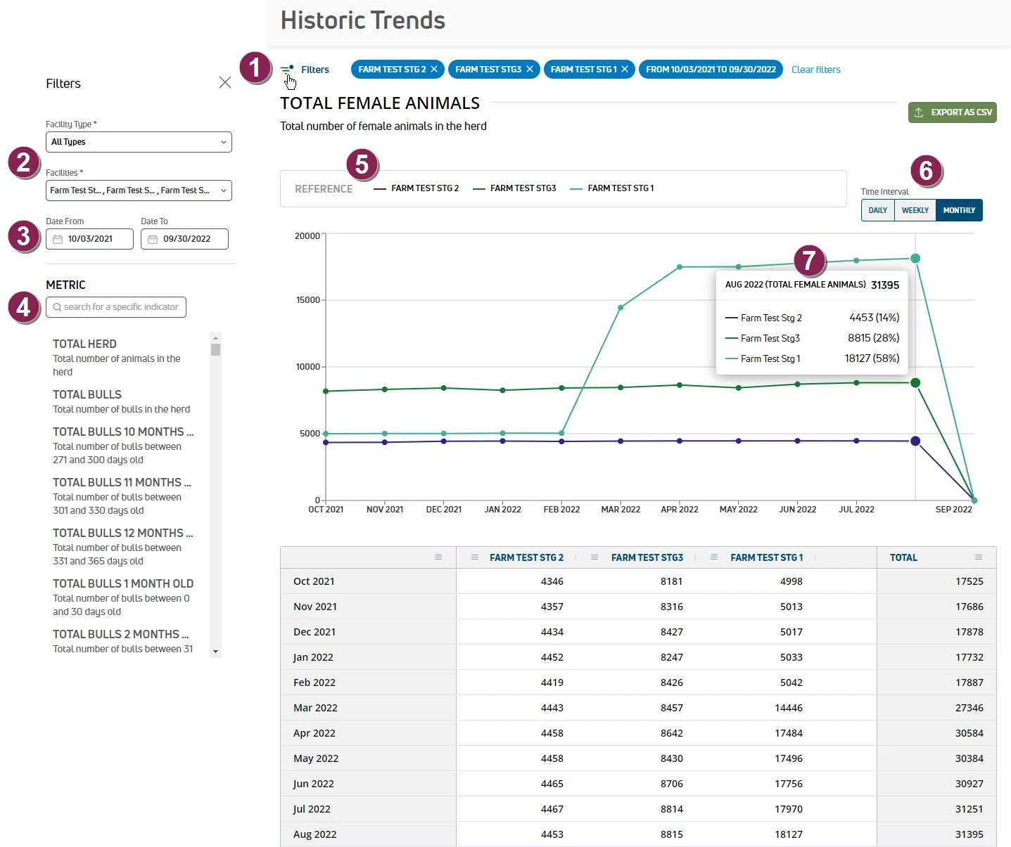
Follow the guidelines below when viewing the Inventory dashboard:
Filters: Click the Filters option on the upper left side of the dashboard to open a side panel where you can manage the data you see in the graph:
Facility filters: Use the Facility Type and/or Facilities filters to manage the facilities shown in the graph. Facilities are listed by dairy name. By default, the graph includes data from all dairies.
Date Range filter: Use the Date From and Date To filters to only view data from that range. By default, the graph includes data from the previous seven days.
Metric filter: Select the specific metric you want to view. There are many metrics to choose from by animal type (female animals, bulls, cows, heifers), age, lactation number, health event, herd change, and breed. For example, you can view the number of bulls, the number of metritis cases, or the number of Holsteins you've had across all dairies in the past month.
References: Each facility is represented on the graph by its own colored line.
Time interval: On the upper right side of the dashboard, you can select the time interval shown in the graph:
- Daily: See 30 days of data by default.
- Weekly: See 20 weeks of data by default.
- Monthly: See 12 months of data by default.
Tooltips: Hover over the graph data to view more detailed information, including animal counts and percentages.