Inventory
4 min
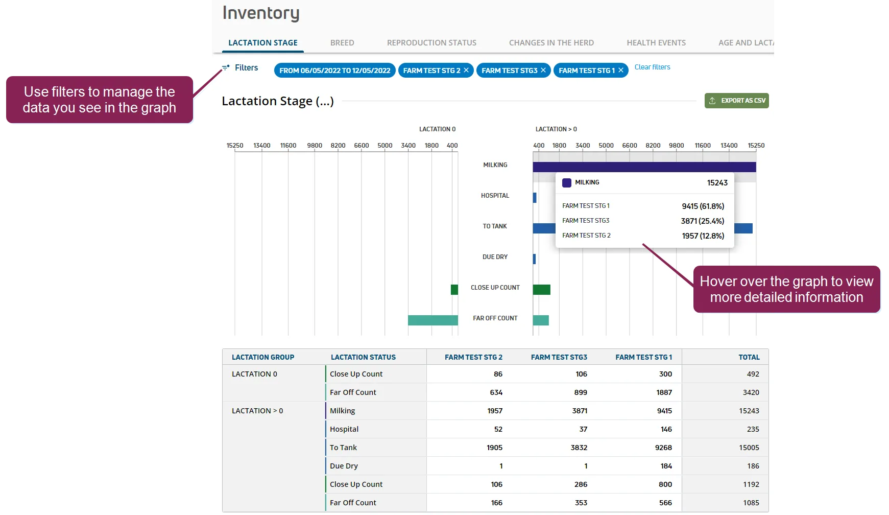
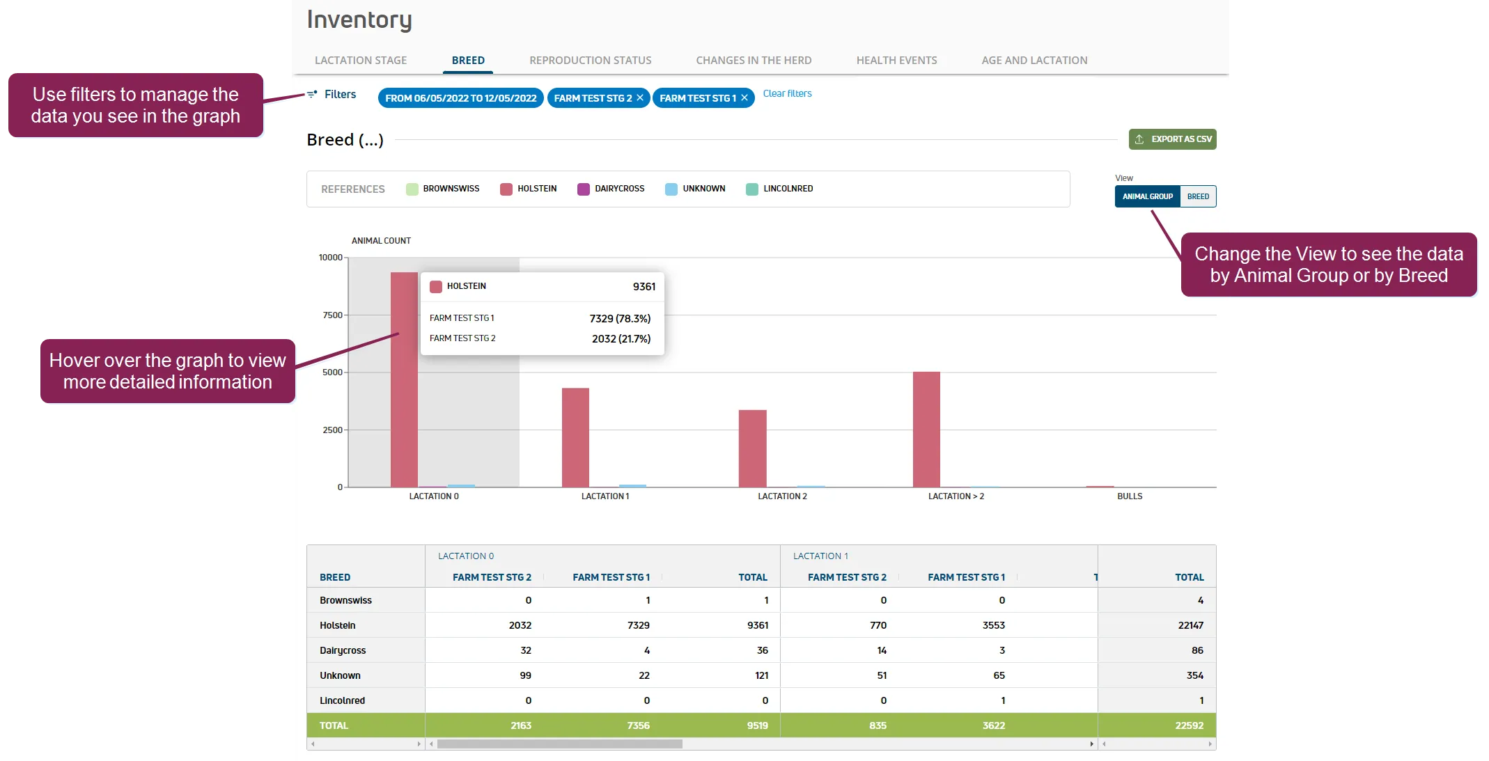
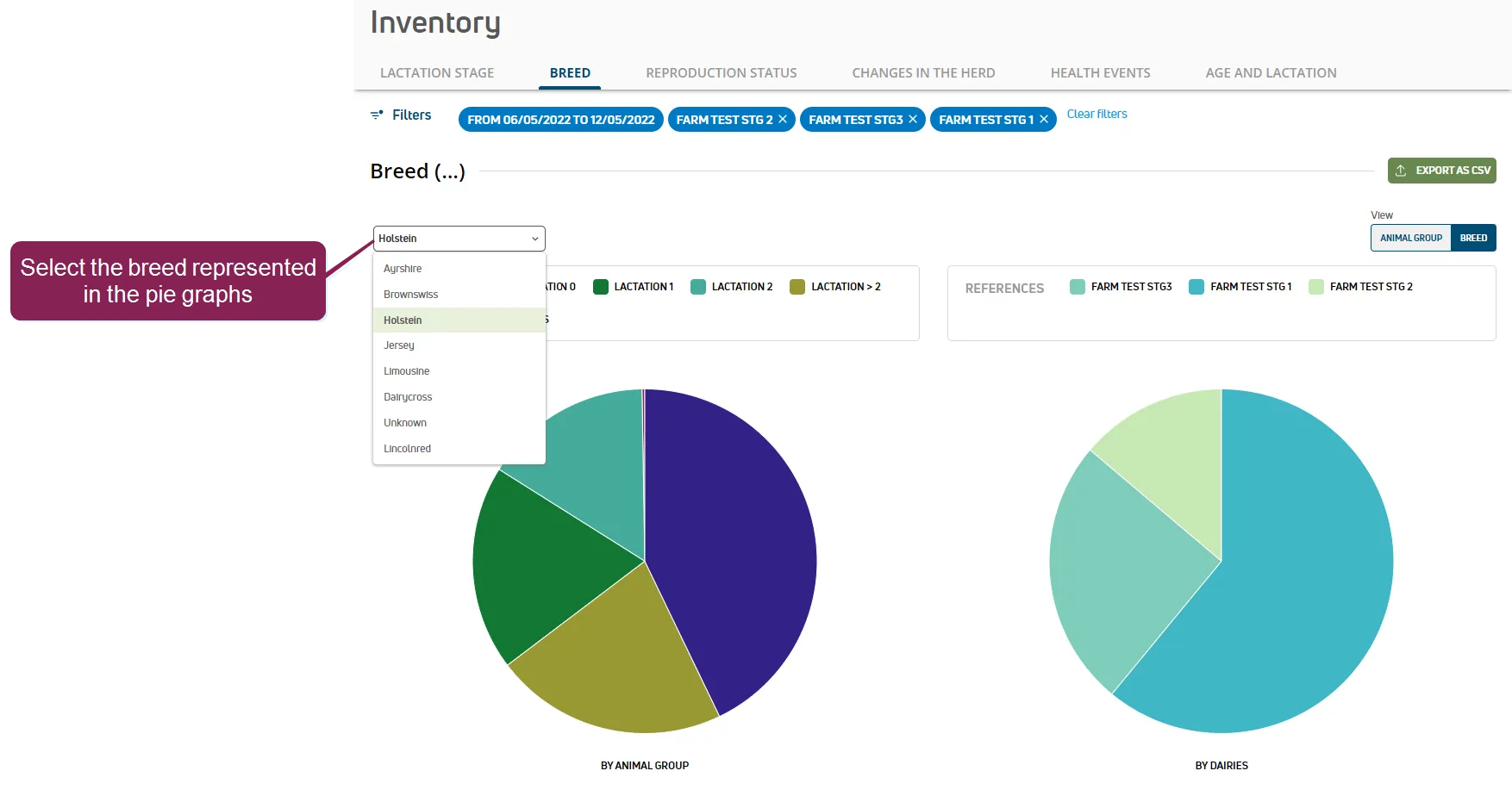
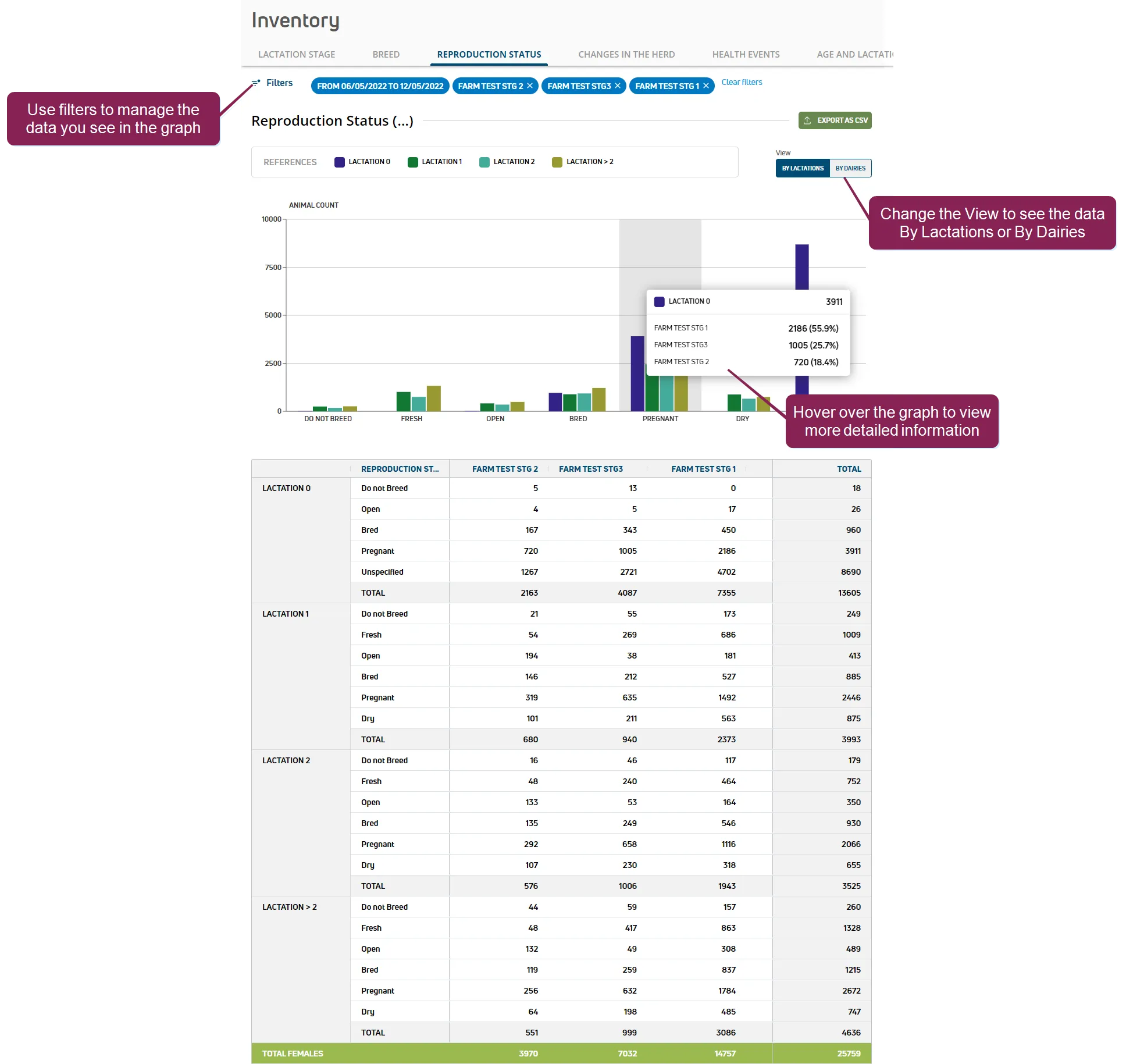
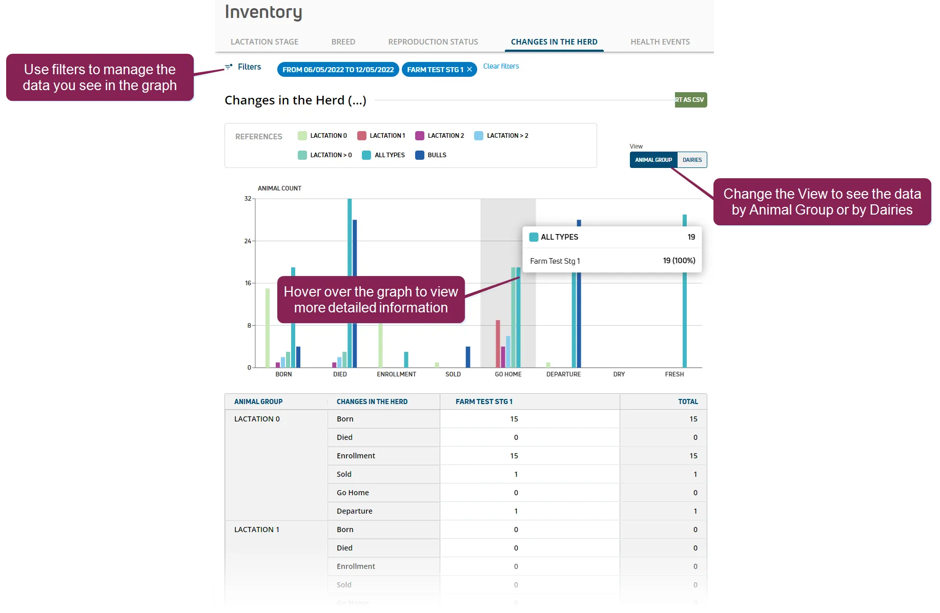
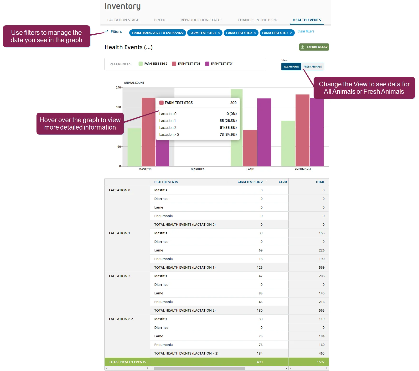
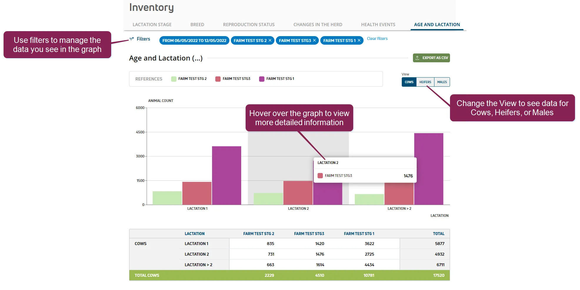
use the inventory dashboard to quickly view your current inventory across all dairies in clear, easy to follow graphs use the data to identify, review, and analyze current inventory trends you can switch between tabs to see the breakdown of your inventory in different ways by lactation stage, breed, reproduction status, changes in the herd, health events, or and lactation group note update your inventory data on a daily basis to ensure that your inventory graphs are always accurate and up to date follow the guidelines below when working with inventory graphs filters click the filters option on the upper left side of the dashboard to open a side panel where you can manage the data you see in the graph facility filters use the facility type and/or facilities filters to manage the facilities shown in the graph facilities are listed by dairy name by default, the graph includes data from all dairies date range filter use the date from and date to filters to only view data from that range by default, the graph includes data from the previous seven days tooltips hover over the graph data to view more detailed information, including animal counts and percentages views on some inventory dashboards, you can change how the graph displays data select different views on the upper right side of the dashboard, where available expand the sections below to learn more lactation stage use this tab to view animals sorted by their lactation status the data is separated into two graphs one for heifers (lactation 0) and one for cows (lactation > 0) the graphs show average values, which are calculated from the data collected every day during the selected date range breed use this tab to view animals sorted by breed change the view to see the average number of animals in each breed by animal group (number of lactations) or by breed during the selected date range the graphs show average values, which are calculated from the data collected every day during the selected date range in animal group view, each bar in the graph represents the average number of animals in each breed sorted by lactation group in breed view, you can only view data for one breed at a time select the breed from the drop down list in the upper left corner by default, the pie chart displays data for holsteins or the company's most popular breed the animal count of the selected breed is shown in two separate pie charts animal group, where each slice represents a lactation group, and dairies, where each slice represents a dairy reproduction status use this tab to view animals sorted by their reproduction status change the view to see the average number of animals in each reproduction status by lactations or by dairies during the selected date range the graphs show average values, which are calculated from the data collected every day during the selected date range in lactations view, each bar in the graph represents a lactation group's animal count sorted by reproduction status in dairies view, each bar in the graph represents a dairy's animal count sorted by reproduction status changes in the herd use this tab to view animals sorted by changes in the herd the graphs illustrate the number of animals that underwent any of the following changes born, died, enrollment, sold, go home, departure, dry, or fresh note departure includes all animals that were sold, died, or go home animals go home includes all calves that have returned from the heifer grower facility to the dairy enrollment includes all animals that have an (enrollment date) within the selected date range change the view to see changes in the herd by animal group (lactation number) or by dairies in animal group view, each bar in the graph represents the number of animals in each lactation group that underwent the listed change in dairies view, each bar in the graph represents the number of animals in a dairy that underwent the listed change health events use this tab to view health event data for your animals after identifying health event trends in your inventory, you can use healthval docid\ rzg4k9p0tb3d8wcdfeyq5 to learn more about the diseases affecting your herd and take necessary measures to prevent or treat illnesses at your dairy change the view to see health event data for all animals or fresh animals the system will show different health events for all or fresh animals, as some conditions are only diagnosed in fresh animals for example, only affects fresh animals, so that event is only shown in the fresh animals view age and lactation group use this tab to view animals sorted by age or by lactation group change the view to see the average number of animals in each age and lactation group for cows, heifers, or males during the selected date range the graphs show average values, which are calculated from the data collected every day during the selected date range in cows view, the number of animals in each dairy are sorted by lactation group in heifers or males view, the number of animals in each dairy are sorted by age in days