View RumINSIGHT Data By Herd
2 min
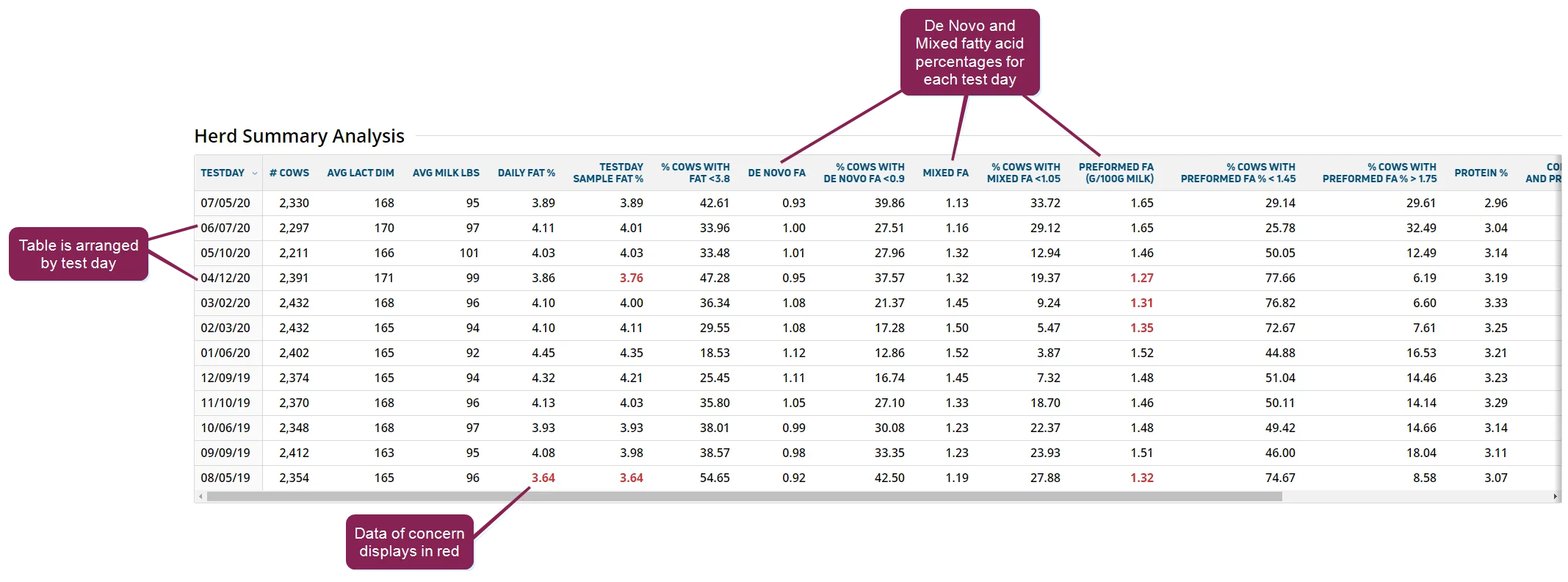
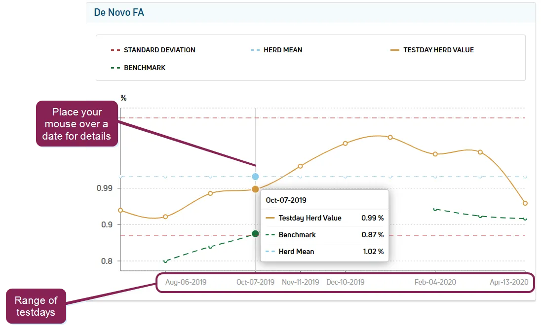
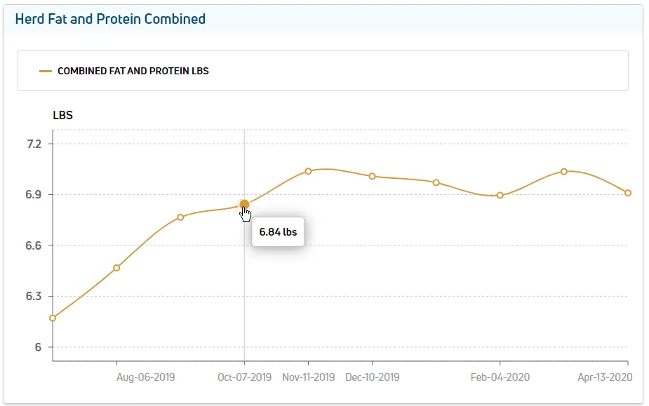
required permissions to use this feature, your vas pulse platform user account must be assigned to a role with herd read permissions see edit dairy user permissions docid\ gw6zx7tfc4ihsbrtozc v and manage dairy roles docid 9yjukdzfab0kko1hw0mxj for more information click the by tab on the ruminsight report to view testing data for the entire herd the top of the page contains a summary of the data by test day beneath that are graphs showing the production trend of the three main fatty acid types (de novo, mixed, and preformed), as well as graphs regarding herd fat and protein expand the sections below to learn more herd summary analysis table the summary analysis table shows a detailed breakdown of fatty acid test results arranged by test day follow these guidelines when viewing the data in this table the column can be sorted in either ascending or descending order (see testdays docid\ ezdiewyrexxlqvuai8k 2 to learn more about test day data ) the table displays summary data for all three types of fatty acid—de novo, mixed, and preformed data values that are of concern (i e , warnings) display in the table in red trend graphs the trend graphs show the progress of production for each of the three types of fatty acids (de novo, mixed, and preformed) over a range of test days an example of a de novo trends graph is shown below move your cursor over the test days in the graph to display precise information for each of the following (displayed in dotted \<font color="#ef4444">red\</font> ) mean (displayed in dotted \<font color="#4283c7">light blue\</font> ) value (displayed in \<font color="#eab308">solid gold\</font> ) benchmark (displayed in dotted \<font color="#67854e">green\</font> ) note benchmark values shown in the trend graphs are calculated using various values collected for the applicable month and are influenced by factors such as breed type and milking frequency they provide a value against which the other values in the graph can be estimated and compared in addition to the three fatty acid graphs, there is also a trend graph for fat and protein this graph works in the same manner as the other trend graphs and displays the following data mean fat % (displayed in dotted \<font color="#eab308">gold\</font> ) fat (displayed in solid \<font color="#eab308">gold\</font> ) mean protein % (displayed in dotted \<font color="#4283c7"> \</font> ) protein % (displayed in solid \<font color="#67854e"> \</font> benchmark fat % (displayed in \<font color="#67854e">solid green\</font> ) benchmark protein % (displayed in solid \<font color="#67854e">dark blue\</font> ) herd fat and protein combined graph the fat and protein combined graph displays the combined amount of fat and protein in pounds for a specific to view exact data for a specific test day, move your cursor over the applicable as shown above