Visualize Event Distribution with EGRAPH
Question: How can I use the EGRAPH command to analyze event distribution and trends in my herd records?
Answer: The EGRAPH command is a visual analysis tool that turns raw event data into interactive graphs that show the distribution of events (like MAST, BRED, or DRY) within your herd.
EGRAPH provides a clear, charted distribution of events, helping you quickly validate protocols, spot unusual event peaks, and identify high-risk periods. By converting records into visual data, it tells you when and where specific health and management events occurred within the herd.
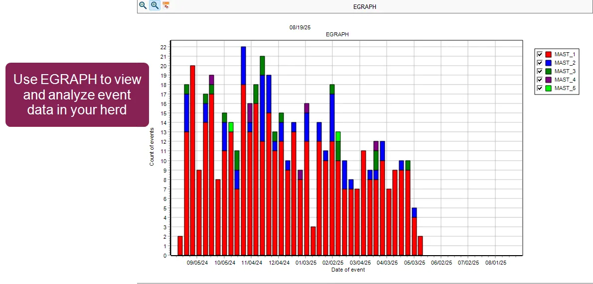
You can run the EGRAPH function using the Options window to select your parameters. Alternatively, you can add parameters to the EGRAPH command directly in the command line.
The easiest way to select events and set analysis parameters is by using the EGRAPH Options window. To open the window, enter EGRAPH in the command line.
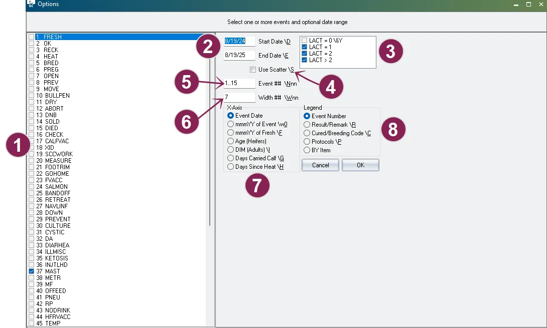
The EGRAPH Options window allows you to choose which events to display in the graph, as well as the specific parameters for how you want the data displayed:
- Event Checkboxes: Select one or more specific event types you want included in the graph.
- If you select multiple events, the graph will display each event type in a separate bar.
- For event types with multiple occurrences (such as MAST_1 and MAST_2), the separate occurrences are stacked and color-coordinated in the bar for that event.
- Start Date / End Date: Defines the historical period you want analyzed. By default, EGRAPH runs for the last 365 days.
- Lactations: Defines which lactations display in the graph. By default, all lactations are selected except lactation 0. EGRAPH cannot merge data for cows (LACT>0) and youngstock (LACT=0) into a single analysis; you must choose to display one group or the other.
- Use Scatter: When checked, the graph runs as an individual scatter plot instead of the default segmented bar graph.
- Event ##: Allows you to control which event occurrences display in the graph. For example, if you've chosen to display MAST events, you can select to display only the second and third MAST occurrences (i.e., MAST_2 and MAST_3) in the graph. By default, this option is set to show all of the event types chosen between the first and fifteenth occurrences (1..15).
- Width ##: Sets the width (in days) of each bar on the graph. Common settings include 1 (for daily data), 7 (for weekly data, useful for smoothing fluctuations), and 30 (for monthly data).
- x-axis: Defines the primary variable by which the events are distributed (the horizontal axis). Options include Event Date (default), DIM (Adults), Age (Heifers), Days Since Heat, etc.
- Legend: Defines the secondary variable used to segment the bars (color-coding). Allows you to break down events by Event Number (default), Result/Remark, Cured/Breeding Code, Protocol, or By Item.
Once you’ve made your selections, click the OK button at the bottom of the window to generate the customized EGRAPH bar graph.
A basic EGRAPH bar graph is shown below as an example of how the EGRAPH function is used to visualize health events over time. This example bar graph displays all recorded mastitis (MAST) events for the herd during the past year.
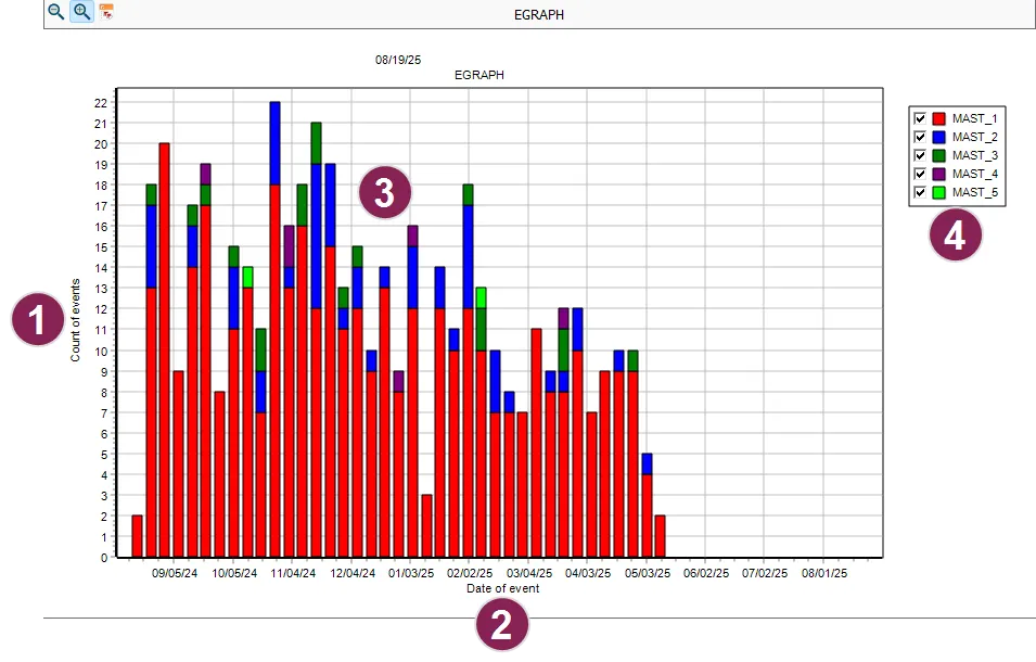
- Vertical axis (y-axis): Shows the total count of events recorded for each date and is always labeled Count of events.
- Horizontal axis (x-axis): Shows the primary way in which the events are distributed. In this example, it's labeled Date of event (the default option for the horizontal axis). This represents the date of each event, covering approximately a one-year period. These parameters can be changed in the EGRAPH Options window.
- Color-coded bars: The total height of each bar indicates the cumulative number of events on a given date, providing an at-a-glance summary of incident frequency and trends. Each color-coded segment within the bars corresponds to a different event occurance (in this case, MAST_1 through MAST_5), as indicated in the legend on the right. This allows you to quickly identify patterns or spikes in specific event types over time.
- Legend: A color-coded key showing the secondary variable being used for event distribution. The example shows what the legend looks when Event Number is chosen as its variable. Checkboxes control which of the variables display in the graph.
This graphical summary enables users to efficiently monitor health event trends, identify periods of increased mastitis incidence, and support management decisions with data-driven insights.
To investigate or "drill down" to see the individual events that make up a bar or bar segment, double-click the area of the bar you want to analyze. When you do, the graph closes, and DairyComp automatically runs an EVENTS command. This generates a detailed, filtered list of all the individual cow events that contributed to that specific segment.
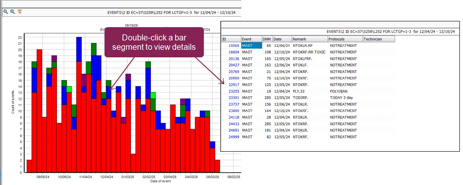
The list is automatically filtered to include:
- All events within the time period (Date or DIM range) you clicked.
- Only the Event Number (e.g., MAST_1, MAST_2) that you clicked in the legend.
The resulting output shows a list of records with the event code (for example, MAST), along with the animal's ID, date, and other details. While the list does not display the Event Number as a separate column, it is filtered to include only the events that match the segment you selected. This allows you to verify exactly which animals contributed to that specific segment or spike on the graph.
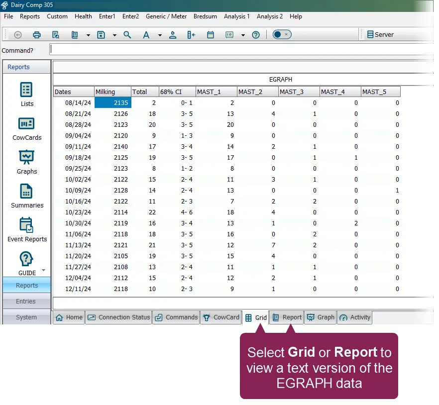
To view a text-based version of the EGRAPH data, select the Grid or Report tab at the bottom of the screen. This is helpful if you need to review, verify, or sort (in the Grid tab) the numeric counts for your analysis. To return to the EGRAPH bar graph, select the Graph tab.
If you want to view a scatter plot version of the graph instead of the default bar graph, check the Use Scatter \S box in the EGRAPH Options window (or by using the command line switch \S).
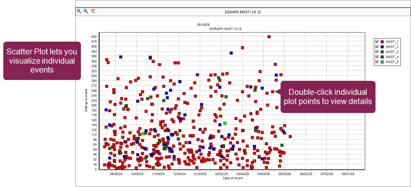
A scatter plot is designed to visualize individual events and is a good way to quickly spot outliers or anomalies. This visual configuration makes it easy to spot events (dots) that are too early or too late compared to the herd average, such as a MAST event occurring very early in lactation:
- Each dot on the graph represents a single event recorded on a single animal.
- The x-axis always displays the Date of event.
- The y-axis always displays the DIM up to the event.
- To drill-down and investigate an individual event, double-click the applicable point on the scatter plot. The animal's CowCard will open, where you can view all the animal's events and other details.
EGRAPH uses built-in logic to ensure event counts are accurate. This logic uses an "event gap" to prevent multiple entries for the same animal within a specific time frame (for example, 7 days) from being counted as multiple, separate occurrences. This means if you record a MAST event on Monday and Tuesday, EGRAPH counts that as one MAST occurrence. The resulting graph is based on these true counts.
The event gap is usually configured as a default setting in DairyComp. You can override this system default for a single graph by adding a colon and the desired number of days directly to the event name in the command line. For example, to force the graph to use a 14-day gap for MAST, enter EGRAPH MAST:14.
If you want EGRAPH to count every single event entry exactly as recorded (without grouping), set the gap to zero: EGRAPH [Event]:0.
The fastest way to run and customize an EGRAPH bar graph is from the command line. By adding the event name(s) and specific switches to the EGRAPH command, you bypass the Options window.
The basic structure for running EGRAPH in the command line is: EGRAPH [EVENT] FOR [CONDITION] \ [SWITCHES]
To run a basic graph, simply enter EGRAPH followed by the event code, such as EGRAPH DRY. If you need to limit the population of animals included in the analysis, you can add a FOR statement. For example:
- Filtering by Parity: To analyze only first-lactation freshenings, use EGRAPH FRESH FOR LACT=1.
- Filtering by Youngstock/Heifers: If you wish to filter for animals with a lactation value of zero (i.e., youngstock), you must also include the \Y switch. The command EGRAPH FRESH FOR LACT=0 \Y will only include heifer freshenings in the analysis.
By default, EGRAPH distributes events along the horizontal axis (x-axis) by the Event Date. To change this to a Days in Milk (DIM) or Age distribution, use the \I switch (for "Intervals").
For example, run EGRAPH BRED \I to show breedings distributed by Days in Milk (DIM) for cows.
When analyzing youngstock, the \Y switch automatically restricts the analysis to animals with LACT=0 and sets the x-axis distribution to Age in Days.
For example, run EGRAPH BRED \IY or EGRAPH PNEU \IY to show events distributed by the animal's age (e.g., heifer breedings or pneumonia events by age).
You can combine multiple switches at the end of the command without any spaces. For example, the switch \W7I sets the width of each bar to 7 and changes the x-axis distribution to intervals.
The following switches are useful for quick customization:
- \S (Scatter Plot): Generates a scatter plot instead of the default bar graph. For example, EGRAPH MAST \S.
- \P (Protocols): Sets the legend/segmentation to display events broken down by the specific protocol used. For example, EGRAPH MAST \P.
NOTE: If the event type selected does not use protocols (such as the BRED event), this switch instead shows the name of the applicable technician.
- \W# (Width): Sets the width (in days) of each bar on the graph. For instance, setting \W7 shows data in weekly bars, useful for smoothing out daily fluctuations. For example, EGRAPH MAST \W7.
- \I (Intervals): Sets the x-axis distribution to Age or Days in Milk, depending on the type of event selected.
- \D# (Days Back): Selects a specific date range, where # is the number of days back from today. For example, EGRAPH BRED \D90 limits the analysis to the last 90 days.
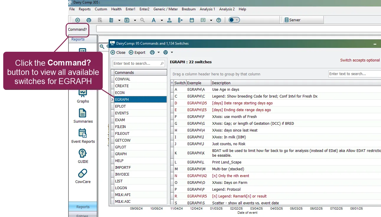
For a complete list of switches available for the EGRAPH command, click the Command? button to open the DairyComp Switch ManagerSwitch Manager and select EGRAPH from the list.
You can print the contents of most pages by clicking the Print button  on the toolbar or selecting Print from the File menu.
Charts and graphs always print in graphic mode and in color if your printer supports it.
To zoom into a selected area on the graph, hold down the left mouse button and drag the box that displays from the upper left to the lower right of the area you wish to enhance.
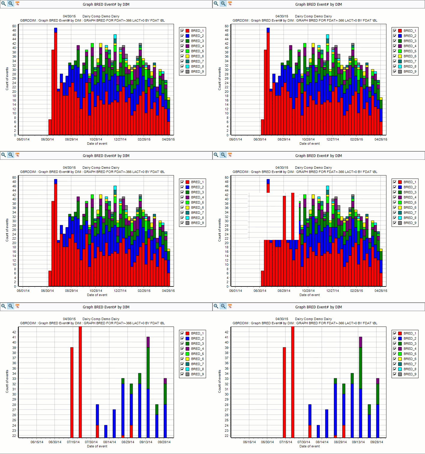
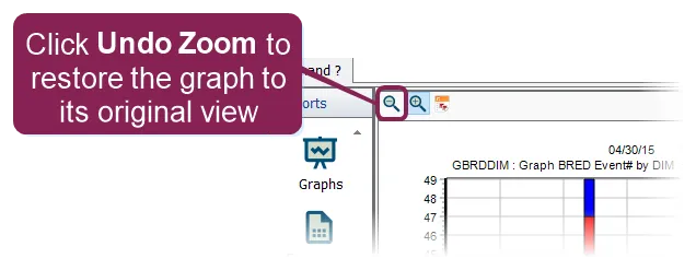
You can restore a graph to its original view by clicking the Undo Zoom.
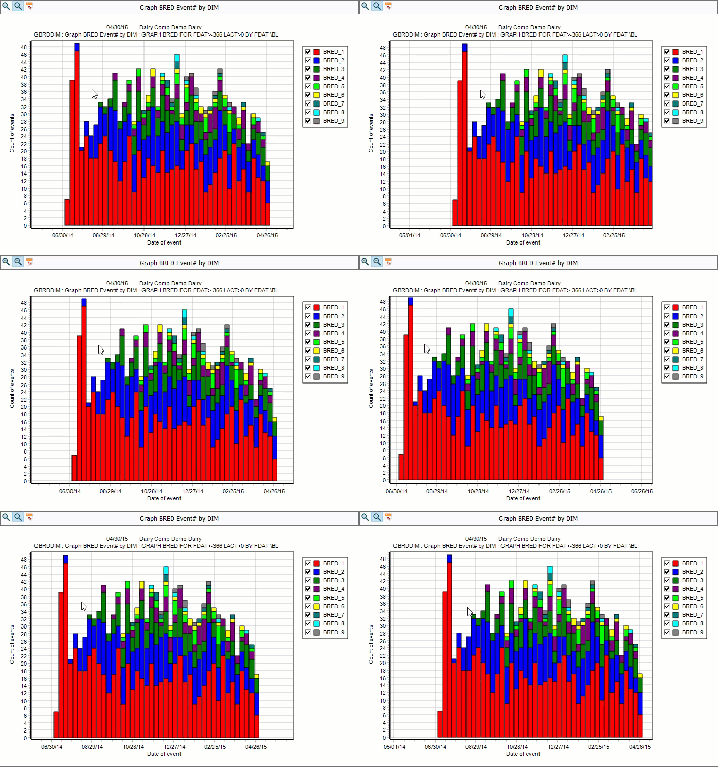
To shift the graph viewing area without zooming in, hold down the right mouse button and drag the cursor around.
You can restore a graph to its original view by clicking the Undo Zoom.