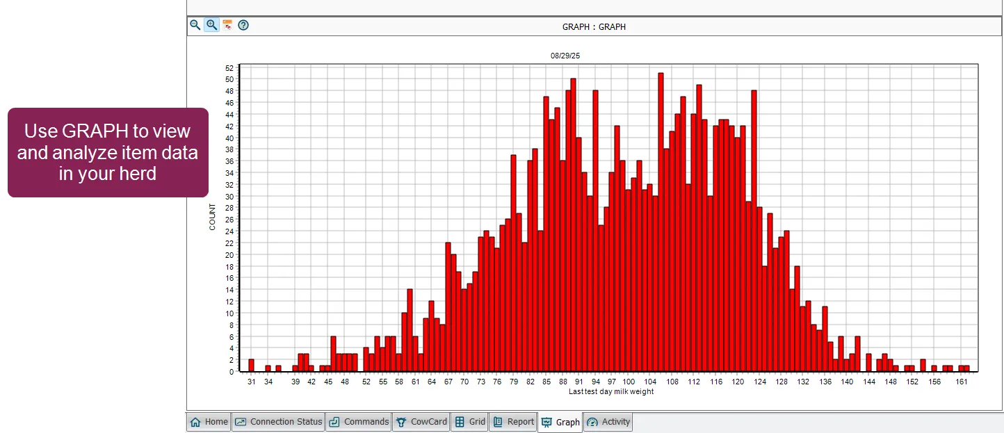
Visualize Item Distribution with GRAPH
3 min
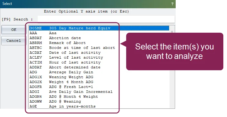
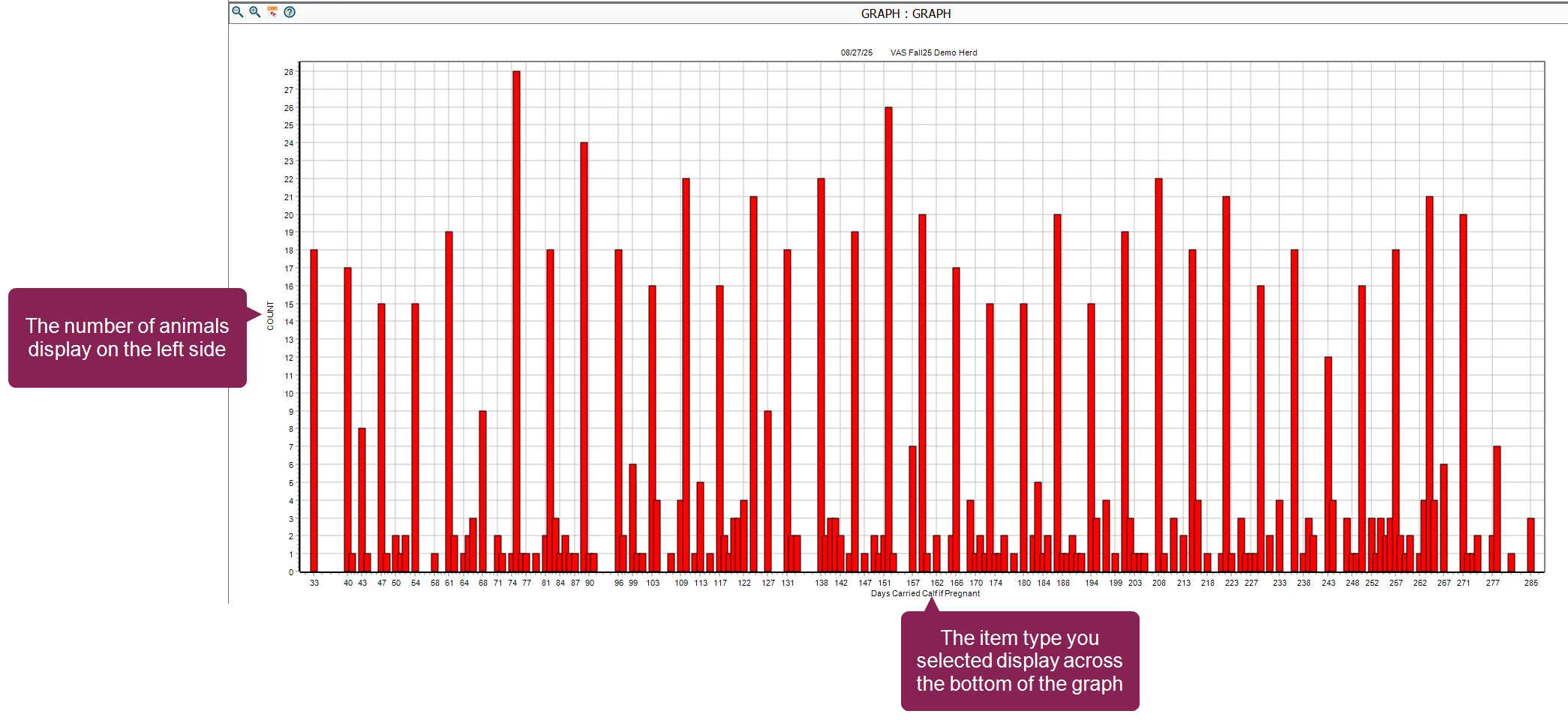
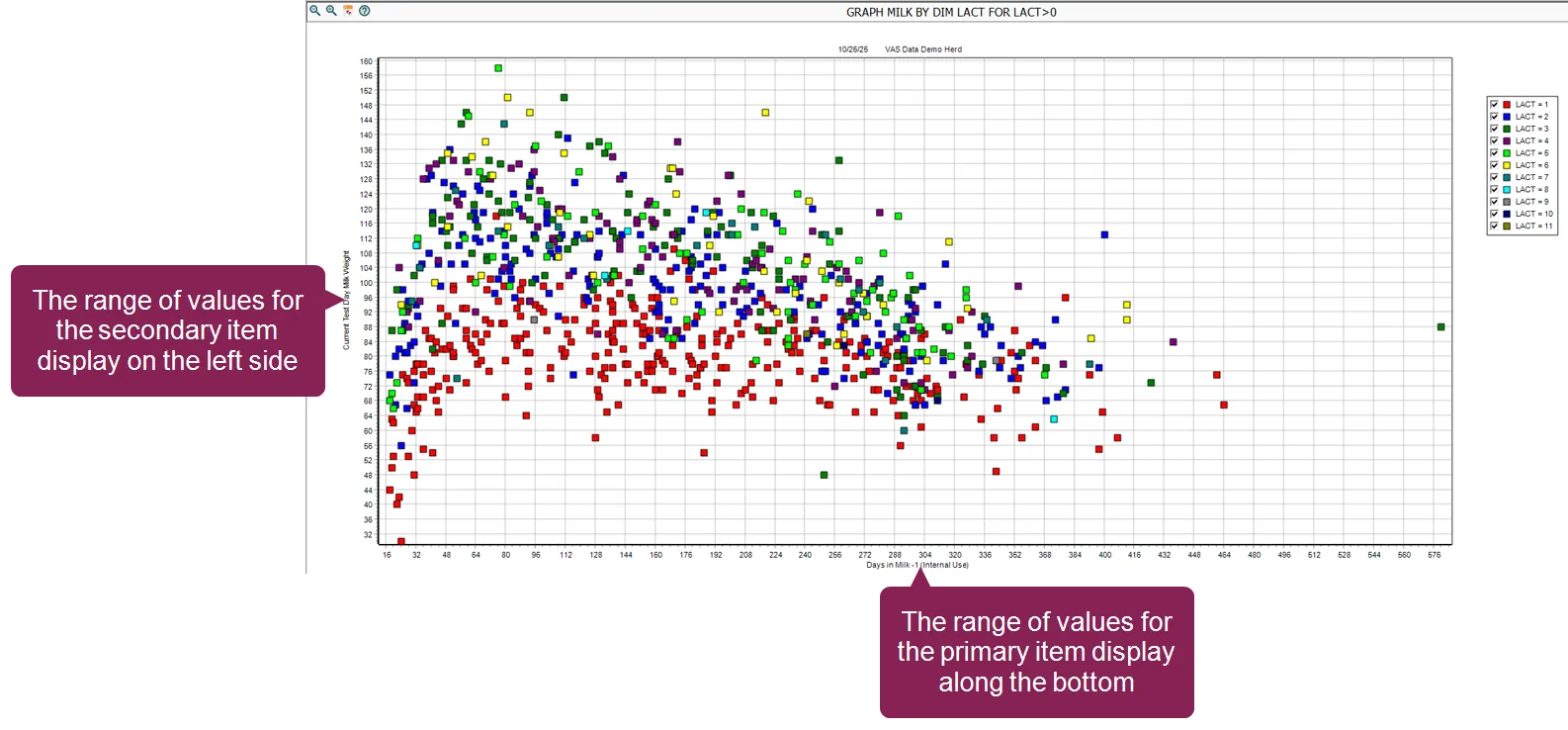
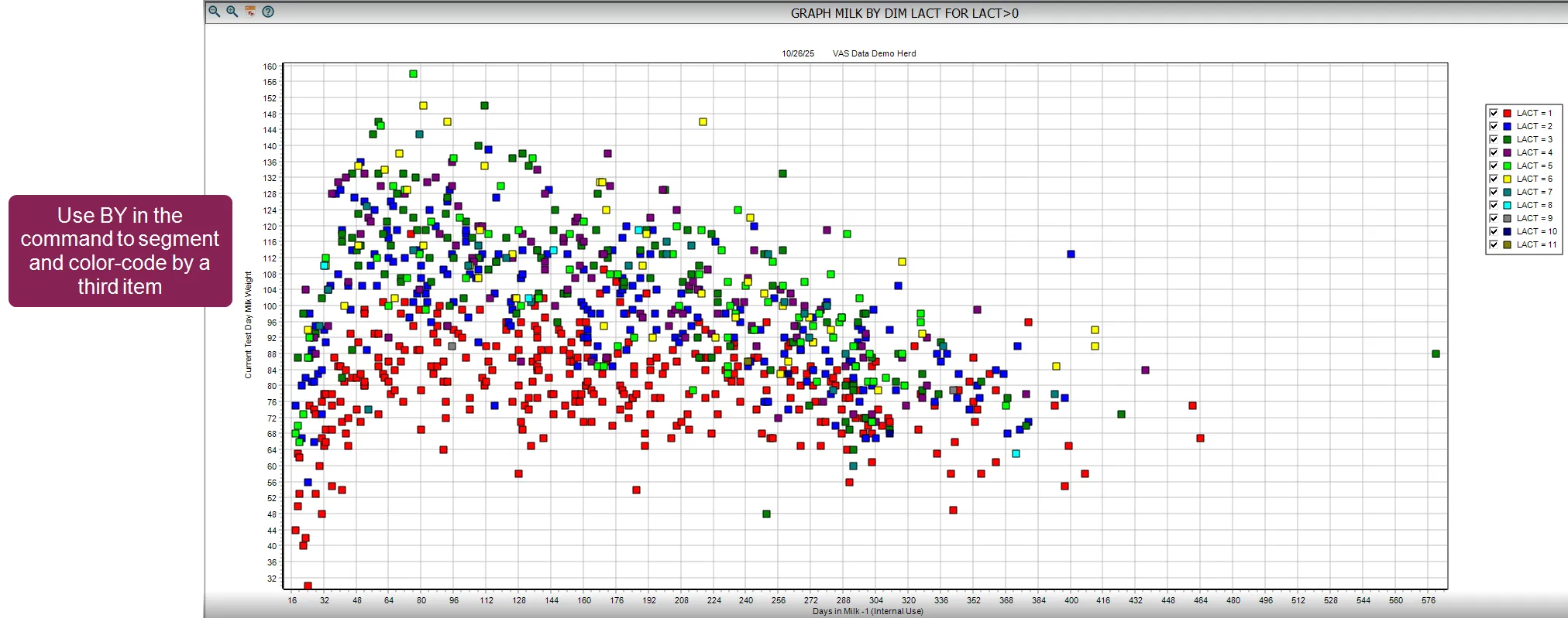
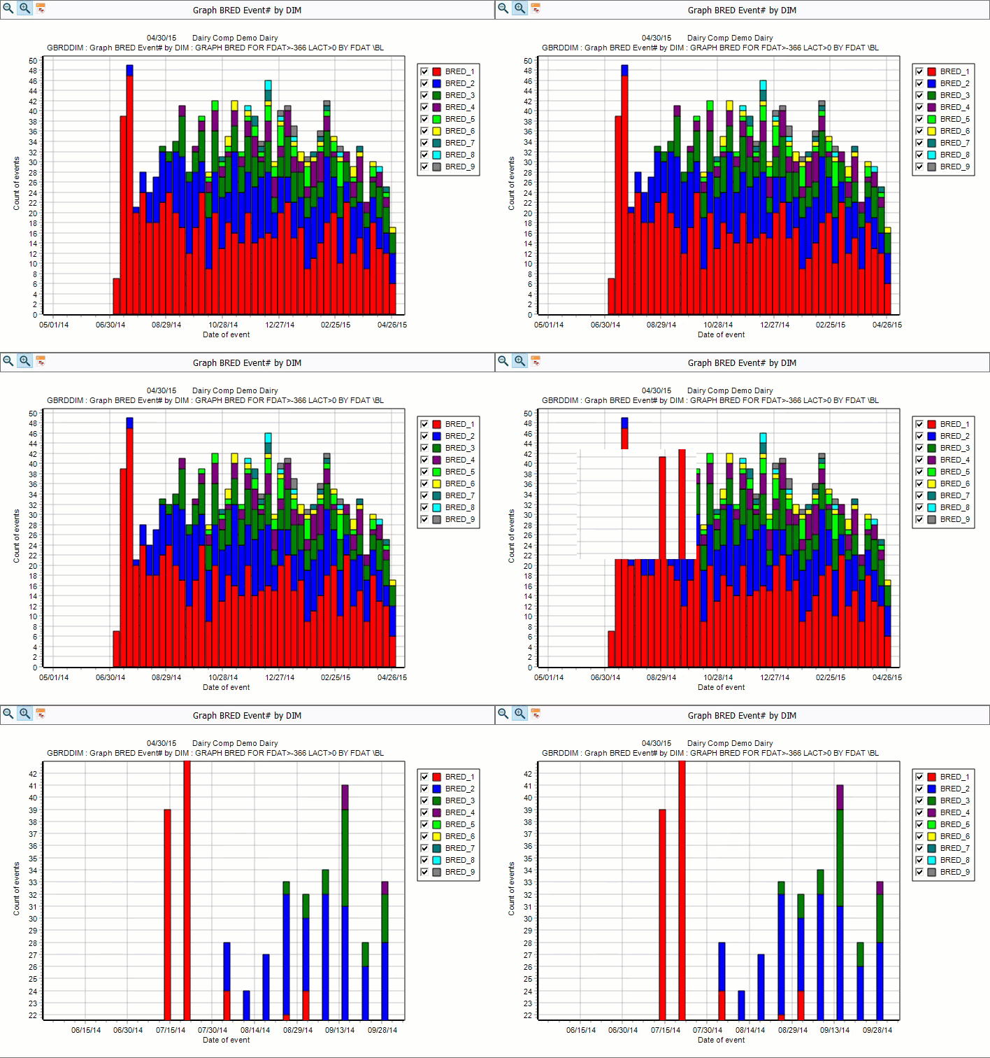
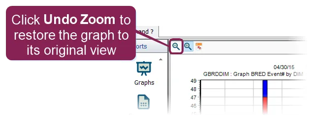
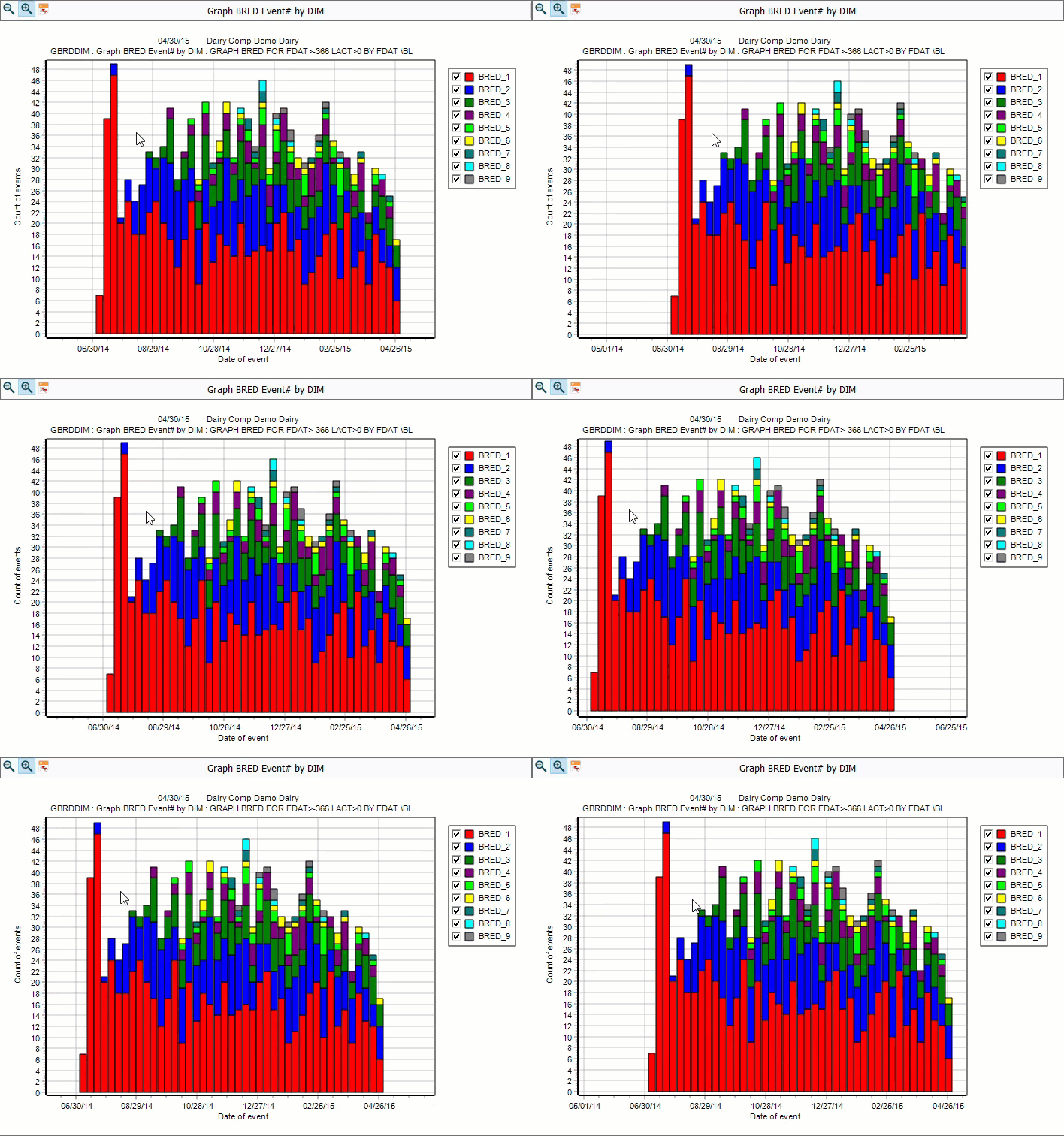
\<font color="#67854e"> question \</font> how can i analyze the frequency or correlation of numeric animal items (like days in milk or milk production) in dairycomp? \<font color="#67854e"> answer \</font> use the command to display the relationship between one or two numeric items (not events) on a graphical basis provides two main types of visual analysis a bar graph showing the frequency or quantity of an item (such as milk values) a scatter plot showing the correlation between two items this function uses any numeric item (for example, milk, dim, or dopn) \<font color="#f97316"> important \</font> do not confuse the command with egraph the egraph command is used for plotting events (like mast or fresh) is for plotting numeric items also, dairycomp automatically runs the egraph command if you enter an event name after the command (for example, mast ) you can run the function using a selection window to choose your parameters (items, range, etc ) for analysis, or you can add your parameters to the command directly in the command line using the item selection window the easiest way to select items and set analysis parameters is by using the item selection window to open the window, enter in the command line from here you choose the item(s) you want to analyze use the search bar at the top of the window to find the applicable items create a frequency distribution graph to create a bar graph showing the frequency distribution of a single item select the item you want to analyze from the window, then click ok when prompted to select a second item, click cancel (or press escape ) do not select a second item your bar graph displays, showing the following information the bottom axis (i e , x axis) shows the item type you selected, along with the range of item values over which the data is distributed the bars of the graph are centered over the specific value (or range of values) on the axis the left side axis (i e , the y axis) always shows the count of animals that is, the number of animals in the herd whose item value falls into the corresponding position on the x axis investigating data points in the bar graph to investigate or "drill down" to see the individual cows that make up a specific bar, double click the bar you want to analyze when you double click a bar, the bar graph closes, and dairycomp automatically runs a show command this generates a detailed, filtered list of the individual animal ids that contributed to that specific bar segment the list is automatically filtered to include only animals whose value for the x axis item (for example, days carried calf) precisely matches the value or range you selected the resulting output is a list of id numbers for the animals, allowing you to easily look up their cowcards or perform further analysis on that specific subgroup create a correlation scatter plot to create a scatter plot showing the correlation between two items from the selection window, choose the first item you want to analyze and click ok choose the second item you want to analyze and click ok again your scatter plot displays, showing a visual representation of the correlation between the two items you chose each point of the scatter plot represents a single animal the x axis displays the range of values for the primary item (i e , the first item you selected) the y axis displays the range of values for the secondary item investigating data points in the scatter plot a scatter plot is designed to visualize individual animal data points showing the correlation between two items to investigate an individual animal and its data, double click the applicable point (dot) on the scatter plot dairycomp will automatically switch you to the animal's cowcardtab, which is the detailed record view you can return to the graph at any time by pressing escape or clicking the graph tab this allows you to quickly view all of the animal's events, health history, breeding information, and other details to investigate why that particular animal falls at that specific intersection of the two plotted items run from the command line the command line is the fastest way to run and customize a graph without using the selection prompts the basic structure for running is \[x item] by \[y item] for \[condition] \ \[switches] you can use a by statement to segment and color code the graph by a third item (up to two are allowed) for example, running milk by dim lact for lact>0 results in a scatter plot of milk vs dim, where each lactation (lact) is shown in a separate color common command line switches you can combine multiple switches at the end of a command without any spaces (for example, \arz ) \<font color="#67854e"> \a (graph averages) \</font> creates a line graph displaying the average y axis value for each x axis interval, rather than individual points \<font color="#67854e"> \r (regression) \</font> adds a calculated regression line to a scatter plot \<font color="#67854e"> \s (survival graph) \</font> creates a survival curve for time to event items \<font color="#67854e"> \z (include zeroes) \</font> ensures animals with a value of zero for the plotted item are included in the averages or counts \<font color="#67854e"> \h (histogram) \</font> forces the output to a histogram/frequency distribution, even if a by item is specified \<font color="#67854e"> \m (match axes) \</font> forces the x and y axes to use the same limits \<font color="#67854e"> \b (both live and dead) \</font> includes both live and dead/sold animals in the analysis this is important for analyzing historical distributions \<font color="#67854e"> \d (dead/sold only) \</font> includes only dispositioned (dead/sold) animals in the analysis \<font color="#67854e"> \x# (x axis max value) \</font> sets the maximum value for the x axis for example, \x400 sets the x axis maximum to 400 \<font color="#67854e"> \y# (y axis max value) \</font> sets the maximum value for the y axis for example, \y200 sets the y axis maximum to 200 print you can print the contents of most pages by clicking the print button on the toolbar or selecting print from the file menu charts and graphs always print in graphic mode and in color if your printer supports it zoom in/out to zoom into a selected area on the graph, hold down the left mouse button and drag the box that displays from the upper left to the lower right of the area you wish to enhance you can restore a graph to its original view by clicking the undo zoom drag graphs and plots to shift the graph viewing area without zooming in, hold down the right mouse button and drag the cursor around you can restore a graph to its original view by clicking the undo zoom