Visualize Test Day Performance Trends with PLOT
3 min
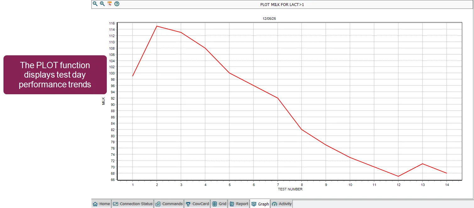
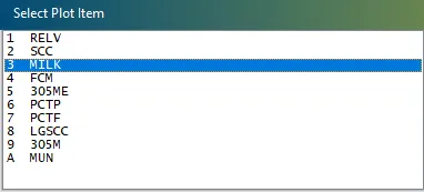
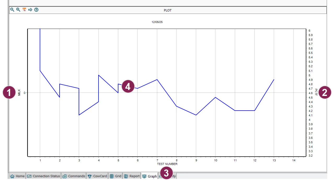
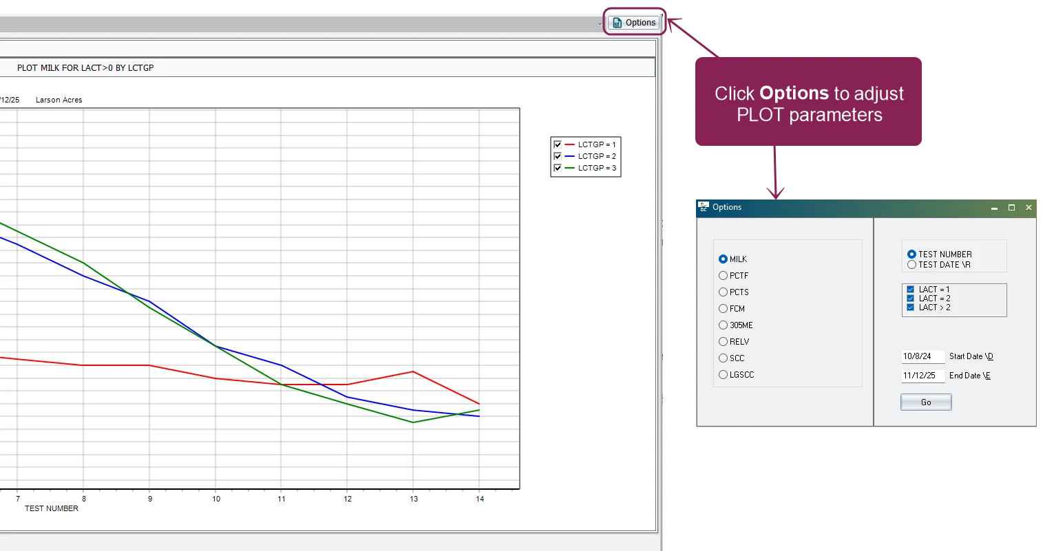
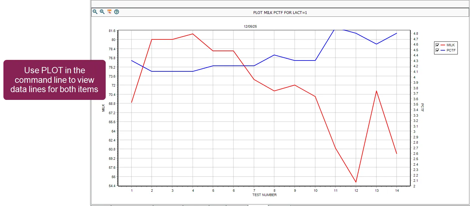
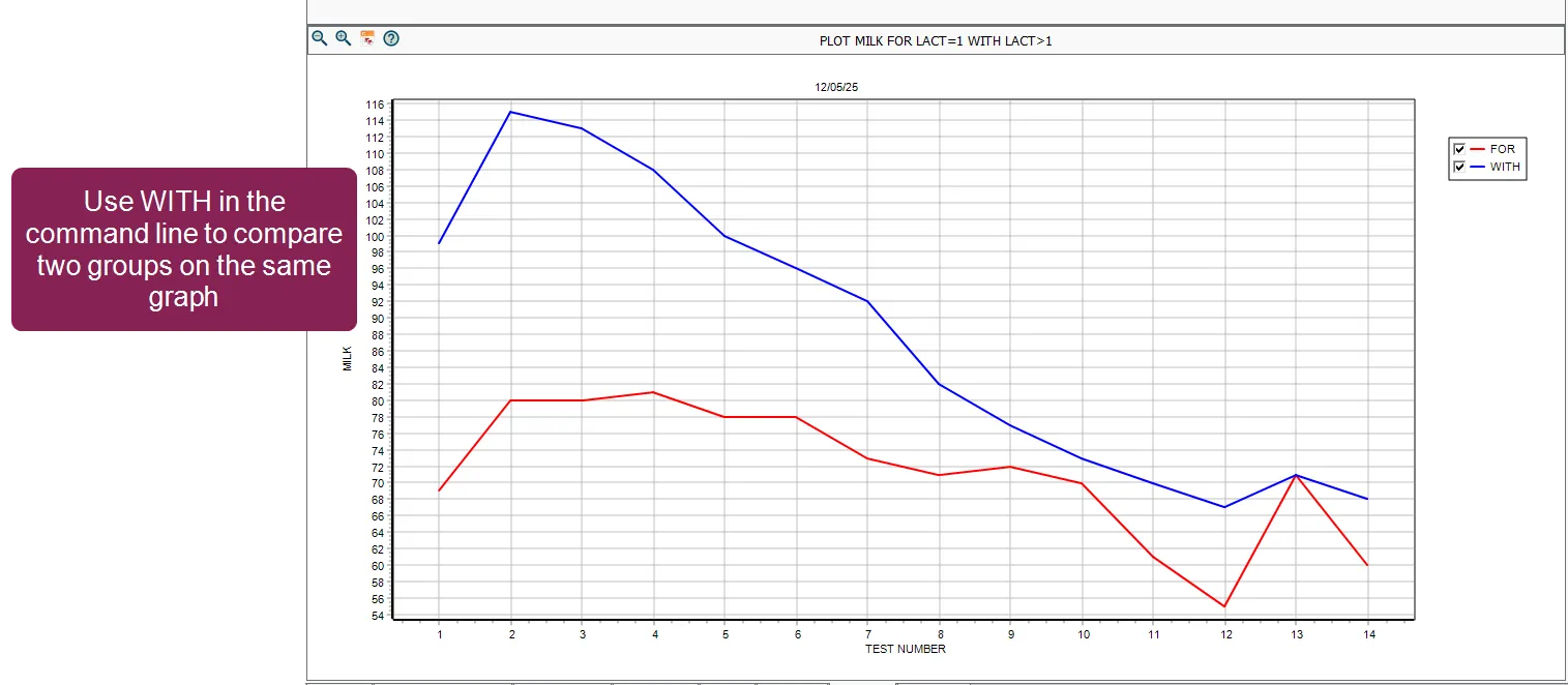
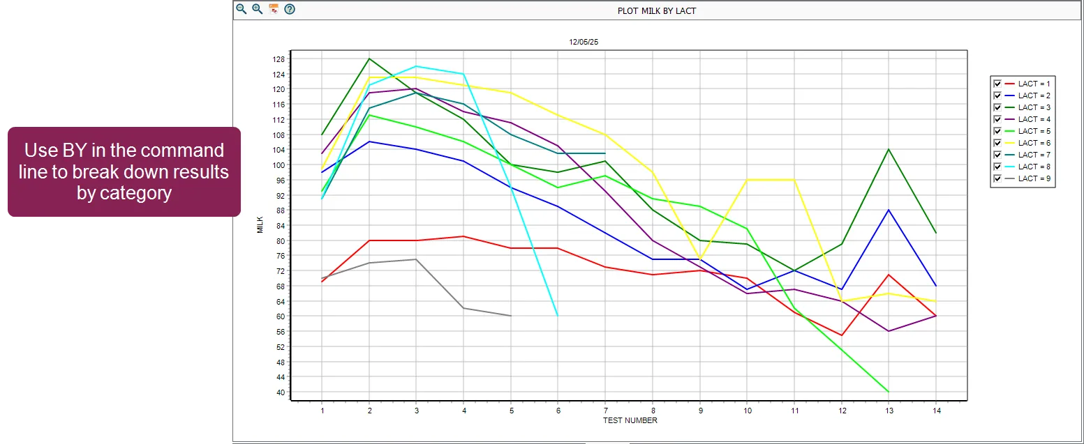
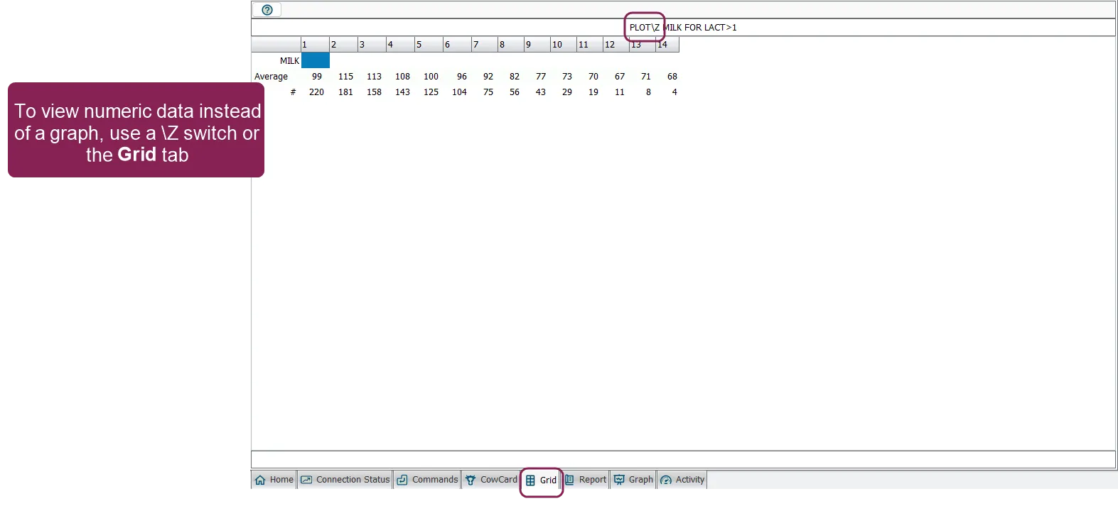
\<font color="#67854e"> question \</font> how can i visualize and compare test day milk and component trends for individual animals or groups in dairycomp? \<font color="#67854e"> answer \</font> use the command to visualize test day performance trends for individual animals or groups lets you display one or more numeric items (such as milk production or fat percentage) as curves on a graph or as raw data tables you can also compare two groups on the same graph or break down results by categories like lactation group, cow breed, or test day pen this function is helpful for analyzing production patterns, monitoring herd performance, and benchmarking different animal groups over time unlike the docid\ rhzbb3lboeiok rljsku8 or egraph docid\ wz70pt9vc4zc9r0pbk2dm functions, which focus on items or events, is specifically designed for historical test day data it can show trends across multiple tests, helping you understand changes in performance over time you can run the function using selection windows to choose the item(s) you want displayed alternatively, you can add parameters to the command directly in the command line run using the selection windows the easiest way to use the function is through selection windows that guide you through the process to do so enter in the command line a window displays for selecting a test day item, such as milk (milk production), pctf (percent fat), or scc (somatic cell count) select the item you want to plot and click ok a similar window appears asking you to select a second item select the second item to plot and click ok (or press escape to plot only one item) enter the applicable animal id, then click ok after you enter the animal id, the function generates a graph showing the selected item(s) across all recorded test days for that animal tip if you want to skip the animal id entry step, include the id in your command for example, for id=38 opens the item selection windows but does not prompt for animal id understanding the output an example graph is shown below, illustrating how the function displays test day data for an individual animal in the example, milk and pctf were selected the left vertical axis shows the scale for the primary item (milk, in pounds) in this specific view, this axis is displayed for reference the right vertical axis shows the scale for the secondary item (pctf, percent fat) this is the item currently represented by the blue data line the horizontal axis , labeled test number, shows the sequence of recorded test days the blue data line represents the second item (pctf) across test days each point corresponds to the animal's recorded fat percentage for that specific test when you select two items interactively, the graph defaults to showing the data line for the second item selected while keeping both axes for reference to see both items as separate, simultaneous lines, you must use the command line or group plotting options described below adjusting plot settings with the options button once a graph is displayed, you don't need to exit and restart the command to change your view click the options button in the upper right corner of the graph screen to open the options window from this window, you can quickly adjust the following parameters \<font color="#67854e"> change items \</font> select a different numeric item to plot (e g , switch from milk to scc or 305me) without re entering the command \<font color="#67854e"> toggle grouping \</font> switch the horizontal axis between test number and test date \r \<font color="#67854e"> filter by lactation \</font> check or uncheck specific lactation groups (e g , lact=1, lact=2, or lact>2) to show or hide their curves on the graph \<font color="#67854e"> adjust date ranges \</font> manually enter a start date \d or end date \e to focus on a specific time period after making your changes, click go to instantly update the graph with your new settings plotting groups and advanced options you can use to analyze groups instead of individual animals add a for statement to filter the population for example, the command milk pctf for lact=1 plots milk production for all first lactation animals, producing a graph with two lines and a legend to compare two groups on the same graph, add a with statement for example, milk for lact=1 with lact>1 plots first lactation animals and overlays mature animals on the same graph to break down results by category, add a by statement for example, milk by lact displays multiple curves for each lactation group on one graph you can also group by other items like cow breed or test day pen (e g , tpen) note when analyzing groups by pen, it is best to use test day pen (tpen) while pen refers to where the animal is standing today, tpen identifies the pen the animal was actually in on that specific test day, ensuring your historical data stays accurate you can use the \z switch to show raw data tables instead of a graph (or simply click the grid tab) these tables list the average values and the animal count (the number of animals included in that average) for each test day this is often used for in depth analysis where you need to see the specific numbers behind the curves tip when analyzing group averages, it is important to notice how many animals are contributing to each data point as you look at later test numbers (such as test #10 and beyond), the number of cows in the group naturally decreases be cautious when interpreting averages based on a small subset of animals, as a few outliers can easily skew the results for the entire group data grouping by default, groups data by test number (test 1, test 2, etc ) in this mode, the graph only includes active animals and their current lactation data to see herd level trends over a chronological timeline, use the \r (reverse axis) switch this changes the horizontal axis from test numbers to actual test dates, allowing you to spot seasonal changes or evaluate overall herd performance over time examples of plotting by date milk\r plots average milk production for the herd by test date milk pctf\r plots milk and fat percentage together by test date unlike the standard view, using the \r switch includes data from both live and dead/sold animals, as well as both current and previous lactations this makes it a powerful tool for historical analysis to narrow your focus to a specific historical period, combine it with the \d switch (e g , milk\rd ) to prompt for a specific date range common command line switches you can combine multiple switches at the end of a command without spaces (for example, \mrz ) common switches include \<font color="#67854e"> \z (table mode) \</font> displays raw numeric data instead of a graph \<font color="#67854e"> \</font> sets custom axis ranges for the graph \<font color="#67854e"> \y (infection rates) \</font> when plotting scc, breaks data into status groups \<font color="#67854e"> \r (reverse axis) \</font> chronologically groups data by test date instead of test number and includes historical (dead/previous lactation) data \<font color="#67854e"> \t (tall mode) \</font> increases the number of increments on the vertical axis (from 16 to 32) \<font color="#67854e"> \b (blank lines) \</font> inserts blank lines between by groups for easier reading \<font color="#67854e"> \d (dates) \</font> prompts for a specific date range for the plot (useful for analyzing specific years or seasons) \<font color="#67854e"> \e (ending date) \</font> sets an ending date for the plot \<font color="#67854e"> \l (archived) \</font> includes archived test data in the plot